Abercrombie says its customer has grown up and it’s growing up, too.
One could say Abercrombie & Fitch is getting boutique-y and intimate.
The all-American brand, in turnaround mode, unveils a new store format on Feb. 17 at the Polaris Fashion Mall in Columbus, Ohio, in a further step in its evolution as the retailer aims to focus on a more mature audience. The last time Abercrombie & Fitch put a real effort into overhauling and re-conceptualizing its stores was 15 years ago.
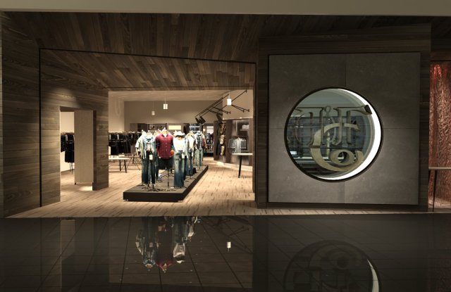
Designed by MJ Sagan Architecture, the 4,860-square-foot prototype, compared to existing stores, is smaller, more open with a bit fewer stockkeeping units, and with a boutique feel. Up front, there’s a long runway of male and female mannequins to encourage outfitting, multiple sales and facilitate personal styling, in a break from the logo-ed A&F uniformed approach of yesteryear.
“This store is so different from what we delivered in the past. It’s really a complete overhaul,” Stacia Andersen, brand president of Abercrombie & Fitch and Abercrombie Kids, said in an exclusive interview.
There’s still the emphasis on denim and casual clothes, yet it’s now in a setting that’s brighter, relaxed — the music has been toned down — and devoid of the suggestive, oversize graphics A&F was known for.
“We are really, really focused on the customer and on who we are,” Andersen said. “We really want to grow up the brand. Our customer has grown up and we want to meet their needs. We’re positioned for the 20- to 29-year-old. The brand is warm, inclusive and really rooted in the heritage of our 125-year-old history.”
Abercrombie & Fitch also wants to grow out of the negative sales and traffic it has seen at stores for several years. In the third quarter of 2016, comparable sales at Abercrombie & Fitch and Abercrombie Kids were down a combined 14 percent.
In the last 18 months, A&F has installed new management, including Andersen, formerly with Target, who was appointed president of Abercrombie & Fitch and Abercrombie Kids in May. There are also new designers and the retailer has sought to reset the image while upgrading the collections with layering pieces, improved fits and higher-quality fabrics targeting those in their 20s, rather than the teen focus of before.
The prototype is the first of seven that will open for business this year. Abercrombie declined to reveal the other six locations citing “competitive reasons.”
“The new Abercrombie & Fitch store design illustrates a strong brand, with a rich history that is evolving and moving forward,” said MJ Sagan, the architect on the project. “A cohesive material palette, an elevated collection and residential scale elements enhance the personal, more intimate aspect of the A&F shopping experience.”
Andersen characterized the prototype as “warm, inviting, inclusive and open” to attract back customers who might have shopped regularly as teenagers, as well as new ones.
She said the prototype was about a year in the making and is built as a mall-based store “where the majority of our stores and the majority of customers are…. We did a lot of customer research before we built out the store and we feel like this [prototype] is really close to where we go with it. Having said that, there might be things we tweak,” after getting customer feedback. She also said elements of the prototype could be applied to existing stores.
The storefront features a metal sculpture of an A&F logo first used in the early 1900s. But the most striking feature is just past the entrance — a 36-foot concrete runway with 40 mannequins. Since the front of the store is open, without any windows, the runway is a visual-merchandising alternative and an eye-catching invitation to enter. “It’s very long and intended to be very dramatic,” Andersen said. “The reason we put the platform down the middle of the store is that our customer loves to see different ways to mix and match.”
The wallpaper is in a graphic print of the logo, but there are no big pictures on the walls, unlike imagery of the past. “We really want the products and forms to showcase how you wear the look,” Andersen said.
The interior has a modern palette of tactile materials — cork, bronze, galvanized steel, concrete, vegan leather, wood and marble — that act as a neutral but complementary background to the collections.
Overall, the store is configured as “a progression” of sections for a sense of discovery. Past the runway, there’s a fragrance “apothecary,” an area for seasonal capsule collections, a sweater shop and a “dominant” denim room. “Our customers’ wardrobe is largely built around denim,” Andersen said.
The fitting rooms are unconventional as well. They’re created as suites, each housing two fitting rooms and an area in between so family and friends can comfortably discuss selections in privacy, before returning to the selling floor. Each suite has controls for lights and music, and a phone-charging dock. The Polaris prototype has two fitting-room suites, and one fitting room that stands by itself, for a total of five fitting rooms.
The scent of A&F will be in the air, but it will be “a lighter, cleaner, gender neutral fragrance,” Andersen said, rather than the overpoweringly heavy one previously spritzed out into the malls.
There was a time when A&F played its music loud. “We will actually have music in the store, but it will be turned down dramatically. It’s mood rather than a disrupter…. Appealing to all of the senses is really important to us,” she said.
By David Moin

