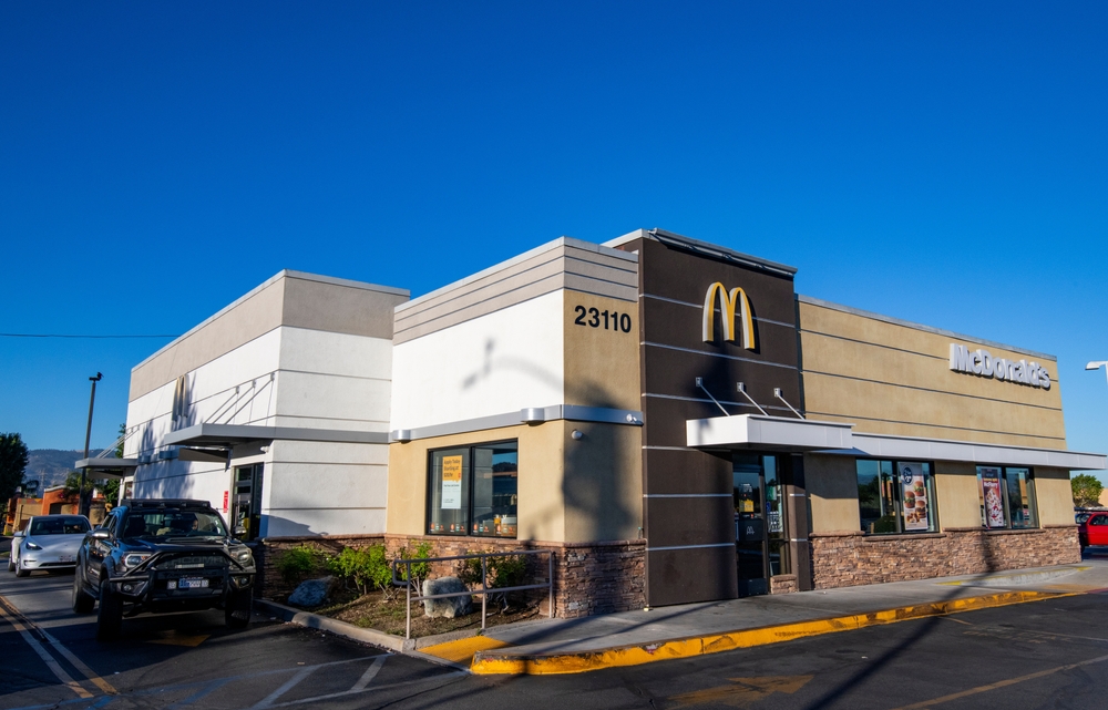
Editorial credit: Robert V Schwemmer / Shutterstock.com
McDonald’s has faced criticism over recent years for adopting a “sterile” store design, likened to a hospital cafeteria or Apple store. The brand has shifted from its vibrant, kid-friendly roots to a more standardized, minimalist aesthetic, reflecting broader trends in fast-casual dining. While some argue this change dilutes McDonald’s unique identity, the company defends its modern design approach, emphasizing sustainability, efficiency, and customer experience. Key locations with distinctive interiors, like in Texas and New York, showcase how thoughtful design enhances customer satisfaction.
Executive Summary: Has McDonald’s Store Design and Layout Become Too ‘Sterile’?

